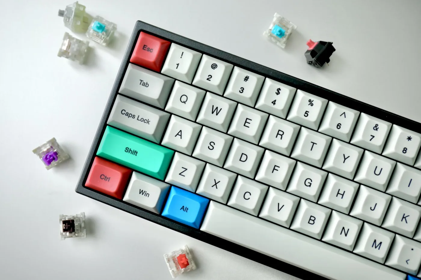

A formatting toolbar with twelve buttons above an editor. Anyone working with the keyboard presses Tab twelve times before reaching the text field. That is the reason the ARIA Authoring Practices prescribe a different pattern for composite widgets. The whole group gets exactly one tab stop, and navigation inside it happens with the arrow keys. Until now this was implemented as a roving tabindex, in JavaScript, rebuilt in every project.
Since Chrome 150 it can also be declared.
What roving tabindex demands by hand
The APG describes the pattern in three steps. On setup exactly one element gets tabindex="0" and all others tabindex="-1". On every arrow key press the tabindex is moved and focus() is called on the target. And when focus leaves the group you have to make sure the element that will be next on Tab carries the value 0. As an alternative the APG names aria-activedescendant, which does not make matters simpler.
Then there is the small print that no short description mentions. Skipping disabled elements. Mirroring the axis in right-to-left writing direction. Deciding whether navigation wraps at the end of the list. Keeping the state current when elements are added or removed by JavaScript.
 Photo: glenncarstenspeters / Unsplash
Chrome names exactly this as the motivation for standardisation in its WHATWG issue. Developers write this logic by hand as a matter of routine, and the result is inconsistent keyboard behaviour and raised accessibility risk. The APG lists combobox, grid, listbox, menu, menubar, radio group, tabs, toolbar, treegrid and tree view, among others, as composite widgets with a single tab stop. That is a lot of surface for hand-written focus logic.
Where it runs
Chrome 150 shipped stable on 30 June 2026 and brings focusgroup with it. Microsoft Edge 150 followed on 2 July 2026, and the Edge release notes use a formatting toolbar as their example. Before that a Chromium origin trial ran from Chrome 146 through Chrome 149.
The basic pattern looks like this:
<div focusgroup="toolbar wrap" aria-label="Formatting">
  <button>Bold</button>
  <button>Italic</button>
  <button>Underline</button>
</div>
No script. One tab stop for the group, left and right arrow move between the buttons, at the end it starts over from the beginning, and on re-entering the group focus lands where it was last.
The syntax has a mandatory token
There is one point here where many early descriptions in circulation got it wrong. focusgroup does not simply take a list of direction and behaviour flags. The first value is a mandatory behaviour token, and optional modifiers follow it.
focusgroup="<behavior> [inline|block] [wrap|nowrap] [nomemory]"

behavior (required): toolbar | tablist | radiogroup | listbox | menu | menubar | none
inline   : left/right arrow only (respects the writing direction)
block    : up/down arrow only
wrap     : arrow keys jump from the last element to the first and back
nowrap   : cancels a wrap default
nomemory : does NOT remember the element focused last
Two details that save mistakes in day-to-day work. The memory token is spelled nomemory, one word, no hyphen. And there is no grid for two-dimensional navigation. The Open UI explainer marks the value explicitly as future and has taken it out of the current proposal. Anyone who needs genuine table navigation still writes it themselves.
Every behaviour token brings its own defaults, which you only need to override if you want something different:
toolbar     -> minimum role toolbar,     default: inline
tablist     -> minimum role tablist,     default: inline wrap,  child role tab
radiogroup  -> minimum role radiogroup,  default: wrap,         child role radio
listbox     -> minimum role listbox,     default: block,        child role option
menu        -> minimum role menu,        default: block wrap,   child role menuitem
menubar     -> minimum role menubar,     default: inline wrap,  child role menuitem
none        -> opt-out for the element and its subtree
A second attribute joins it. focusgroupstart defines which element receives focus the first time the group is entered.
<div focusgroup="listbox" aria-label="Suggestions">
  <div tabindex="-1">First entry</div>
  <div tabindex="-1" focusgroupstart>Recommended entry</div>
  <div tabindex="-1">Third entry</div>
</div>
The memory takes precedence here. Once the group has been left, the element focused last wins over focusgroupstart. If you really want to land on the defined starting point every single time, combine it with nomemory.
The roles come along, and that is the real intervention
focusgroup is not a pure behaviour attribute. It assigns an ARIA role when a generic container such as a div does not have one yet. Native elements keep their semantics. Child roles are derived: a button in focusgroup="tablist" becomes role=tab, in menu or menubar it becomes menuitem, in listbox it becomes option, and in radiogroup it becomes radio. Only toolbar assigns no child role, which makes it the least intrusive of the seven patterns.
That design is deliberate. An earlier proposed, unscoped version of focusgroup had failed over accessibility problems. The current scoped variant therefore limits usage to patterns that come with a minimum role. So you do not get the arrow keys without the semantic consequences.
 Photo: majortomagency / Unsplash
Nesting is defined. An inner focusgroup opts itself out of the outer one automatically, and focusgroup="none" removes an element together with its subtree from the arrow-key navigation of its ancestors.
What the attribute does not take on
Navigation only. On the radiogroup example Chrome states unambiguously that the selection code stays with the developer. aria-checked, aria-selected, toggle states, opening menus, all of that you still write yourself.
// focusgroup navigates, you maintain the state yourself
group.addEventListener('focusin', (event) => {
  const item = event.target;
  for (const other of group.children) {
    other.setAttribute('aria-checked', String(other === item));
  }
});
So anyone hoping that one attribute would replace half the widget will be disappointed. It replaces the part everyone should have been building the same way anyway.
The state of assistive technology
This is where it gets thin, and that belongs in the picture. A systematic, published screen reader test series on focusgroup does not exist at this point.
What does exist is Adrian Roselli’s Focusgroup Tests from 5 July 2026, updated on 14 July 2026. He built six script-free demos covering listbox, menu, menubar, radiogroup, tablist and toolbar and examined them in Chrome 150, chiefly through the accessibility tree and the accessibility APIs. Three of his findings matter in practice.
First, role="presentation" or role="none" on a node carrying focusgroup does not take effect. The derived role stays visible in the accessibility tree. So you cannot take over the interaction and shed the role obligations that follow from it at the same time.
Second, focusgroup="menubar" on its own changes no roles at all in his demo. A list keeps its native semantics, and the attribute does not override them. Only once role="menubar" is set in addition do the li child elements lose their role and button children get promoted to menuitem. So the derivation applies where no semantics were there before, and anyone who genuinely needs the roles still sets them by hand and accepts the relabelling of the markup.
Third, in his test a button with focusgroup="none" still accepted Tab focus alongside its neighbours, but kept the role of the element instead of the required child role.
 Photo: ryanancill / Unsplash
Roselli says himself that he did not do full screen reader testing and is not a daily screen reader user. James Scholes corrected him on the behaviour of the virtual cursor in NVDA and JAWS in forms mode. Steve Frenzel published an assessment of the proposal on 20 April 2026, in which he questions the need for a separate radiogroup pattern alongside fieldset and notes missing feedback for JAWS and NVDA users in the chatbot demo, based on the existing demos.
I have not tested focusgroup myself and therefore claim nothing about NVDA or JAWS announcements. The state of things is that the role derivation has documented edges and the announcement side is open.
Standardisation and browser situation
focusgroup is not part of the HTML Living Standard yet. The specification PR whatwg/html#11723 was opened on 29 September 2025 and was still open at the time of research, with reviewers from Mozilla among those requested. The ARIA mapping runs separately in PR w3c/aria#2778, review-ready since 22 May 2026 and labelled waiting for implementations. It records that the attribute itself has no direct accessibility API mapping and that the user agent only derives the roles.
Mozilla issued a positive standards position, WebKit has set none to date and files the entry under the label concerns: device independence. There is no MDN reference page for the attribute yet, and as of 27 July 2026 the URL returns a 404. The caniuse entry is missing as well, with the feature request issue open since 20 February 2022. Polyfill attempts exist as npm packages, among them one from Microsoft that Chrome names as a fallback in its intent to ship. I have not evaluated them.
If you want to know what a situation like this feels like, the parallel is the View Transitions API. A useful feature, shipped in one engine, with a fallback in production code.
Using it today
Feature detection is two lines:
if ('focusgroup' in HTMLElement.prototype) {
  // browser handles arrow keys, tab stop and memory
} else {
  // activate your own roving tabindex
}
For a production project I would go about it like this. Start with toolbar, because the only pattern without child role derivation carries the smallest risk, and leave the existing roving tabindex in place as a fallback rather than deleting it. With menubar and listbox a look into the accessibility tree in DevTools pays off first, to see which roles actually arrive in the end. And do not rebuild a structure just so that focusgroup fits it.
What the attribute does not change is the obligations. WCAG 2.1 requires in 2.1.1 Keyboard at Level A that all functionality is operable through a keyboard interface, in 2.4.3 Focus Order a focus order that preserves meaning and operability, and in 4.1.2 Name, Role, Value the correct assignment of roles. Through EN 301 549 keyboard operability also hangs on this in the context of the European Accessibility Act, implemented in Germany as the BFSG. An attribute that assigns the roles itself does not take the testing off your hands, it only moves it. Much as with WebGL and accessibility, what counts in the end is what reaches the user.
 Photo: bayusyaits / Unsplash
In short, focusgroup solves a real problem and saves code nobody enjoys writing. The role derivation is the part you have to understand before deploying it widely.
If you have a widget where the keyboard sticks, a toolbar, a tab set or a menu, I am happy to look at it and tell you whether focusgroup already makes sense there today or whether the roving tabindex stays the quieter solution for you. Just get in touch.
FAQ
What exactly does the focusgroup attribute do?+
It gives a container the keyboard behaviour of a composite widget declaratively. The browser takes over arrow-key navigation between the child elements, provides a single tab stop for the whole group and remembers the element that was focused last. Precisely what you would otherwise build as a roving tabindex in JavaScript.
Which values does focusgroup accept?+
A behaviour token is mandatory, and the options are toolbar, tablist, radiogroup, listbox, menu, menubar and none. On top of that come the optional modifiers inline or block for the axis, wrap or nowrap for what happens at the end of the list, and nomemory. The grid value once discussed for two-dimensional navigation is marked as future in the Open UI explainer and is not available in Chrome 150.
Does focusgroup work in Firefox and Safari?+
No. It currently ships in Chrome 150 and Edge 150. Mozilla issued a positive standards position, but that is not a commitment to implement. WebKit has not set any position in its positions repository so far. Anyone using the attribute today needs a fallback.
Does focusgroup replace the ARIA work on a widget?+
Only the navigation part. On the radiogroup example Chrome states explicitly that selection state remains the developer's job. aria-checked, aria-selected, aria-expanded, toggle logic and opening menus all stay hand-written.
Want to know more?
In a free intro call we discuss how you can use these topics for your company. Not a sales pitch, but an honest assessment.
Book a free intro call