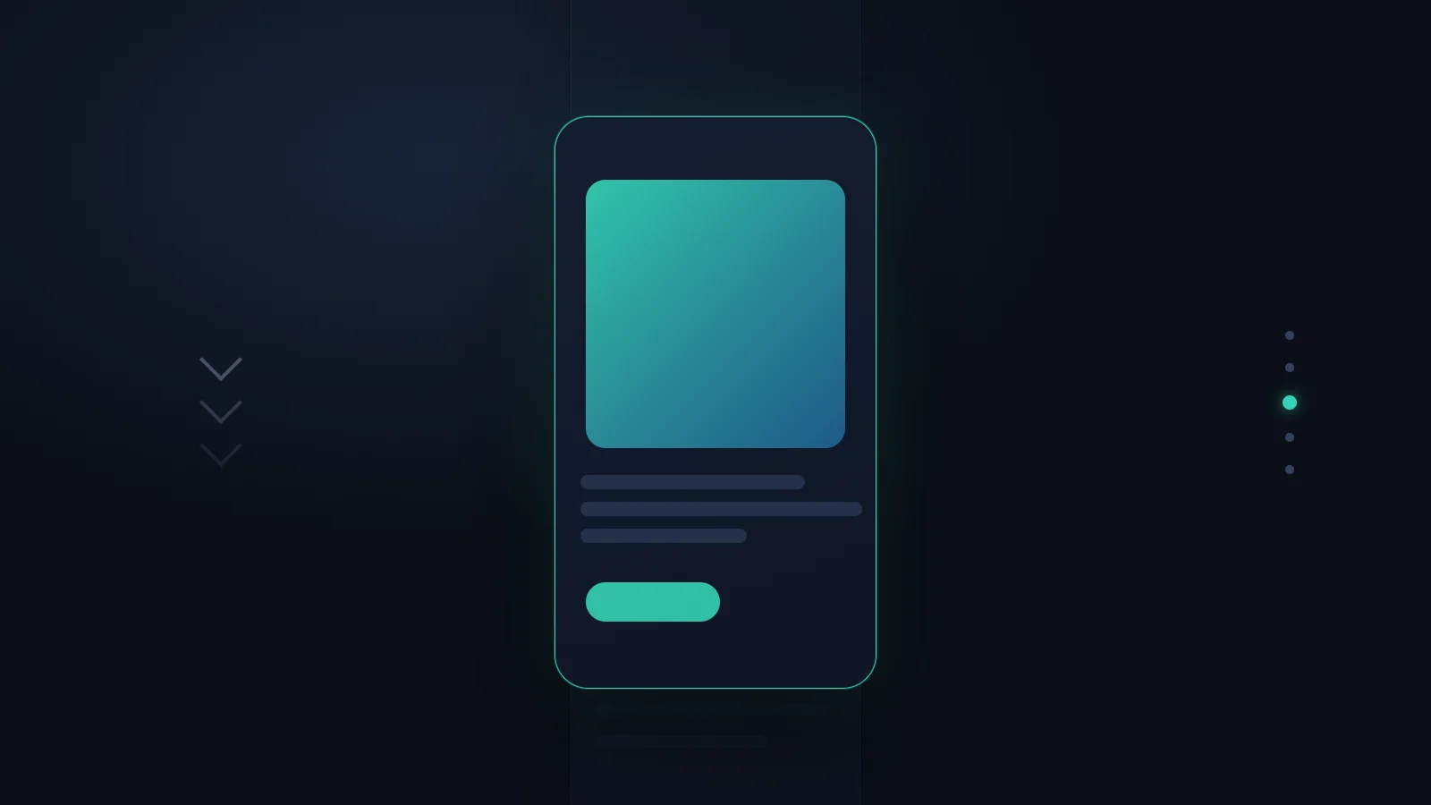

There’s one effect that instantly makes a website look expensive: you click a product, and instead of a hard jump the image glides smoothly to its new position while the rest fades softly behind it. For a long time this was a privilege of single-page apps - you bought it with React, a router and an animation library like Framer Motion or GSAP, and paid with complexity, JavaScript weight and an architecture you didn’t actually want.
Since the View Transitions API landed in browsers, that trade-off is gone. The same effect is now native - a few lines of CSS, and these days even on ordinary websites built from separate HTML pages. I build sites like that for clients and use the API in production, so here’s the 2026 field report: what genuinely works, where the limits are, and when the effort pays off.
The core principle in one sentence
The View Transitions API always works the same way: the browser takes a snapshot of the old state, swaps the content in the background, takes a snapshot of the new state - and then cross-fades from one to the other via CSS animation. So you don’t describe the animation step by step; you just tell the browser: here’s before, here’s after, do the rest. That’s the whole trick, and it’s why so little code is needed.
The simple case: transitions within a page
Classically the API came from the single-page world, where content changes via JavaScript without the page reloading. There you wrap the DOM change in a single call:
if (document.startViewTransition) {
  document.startViewTransition(() => updateDOM());
} else {
  updateDOM(); // browsers without support: just update directly
}
updateDOM() is the function that actually swaps the content - filtering a list, revealing a detail, whatever it is. The browser handles the rest: snapshot before, snapshot after, soft cross-fade. That if isn’t a detail, it’s mandatory - more on that under the limits.
The returned object gives you control when you need it:
const transition = document.startViewTransition(() => updateDOM());

await transition.ready;    // animation is about to start - trigger your own effects here
await transition.finished; // animation is done
You rarely need this at the start. The default transition - a soft cross-fade - works entirely without these promises.
The real breakthrough: transitions between two pages
The interesting part for most real websites isn’t the single-page app, though. Most company sites, shops and portfolios are made of perfectly ordinary, separate HTML pages - and this is exactly where the soft cross-fade was technically impossible until recently, because a page change discards the entire document.
Since Chrome 126 that works too, and remarkably undramatically. In the CSS of both pages - the old one and the new one - you write this rule:
@view-transition {
  navigation: auto;
}
That’s it. Not a line of JavaScript, no router, no framework. As long as both pages share the same domain, the browser now cross-fades the change. A static site made of HTML files gets the same smooth feel you’d previously have needed a single-page app and its entire apparatus for.
To me this is the actual turning point: the app look is no longer tied to app architecture. You can build a fast, lean multi-page website - which from an SEO and performance standpoint is almost always the better choice anyway - and get the smooth transitions on top.
 Photo: florianolv / Unsplash
Making one element travel
Cross-fading the whole page is the default. The effect that really impresses is a different one: a single element - a product image, a heading, a card - stays visible across the page change and travels to its new position while everything else fades. To get that, you give the element the same name on both pages:
.product-image {
  view-transition-name: hero-image;
}
If an element with view-transition-name: hero-image appears on the listing page and also on the detail page, the browser understands: this is the same thing. It glides it from the old spot to the new one, adjusting size and position automatically. That’s the heart of the effect that makes a site look expensive - and it costs one line of CSS per element.
One detail that quickly becomes a trap: every view-transition-name must be unique on a page. Assign the same name twice - accidentally in a loop over all product cards, say - and the transition breaks. For lists, each element needs its own individual name.
If you want to replace the default fade with something of your own, you can address the individual phases via pseudo-elements:
::view-transition-old(hero-image) {
  animation: 300ms ease-out both slide-out;
}
::view-transition-new(hero-image) {
  animation: 300ms ease-in both slide-in;
}
::view-transition-old is the snapshot of the old state, ::view-transition-new that of the new one. Between them sit ::view-transition-group and ::view-transition-image-pair for finer control - but for the vast majority of cases the built-in transition is enough and you never touch that layer.
The limits in 2026, named plainly
As elegant as the API is, it isn’t equally far along everywhere. Where things stand today:
Transitions within a page work in Chrome and Edge from version 111, Safari from 18 and Firefox from 144 - broad enough for production use. Transitions between two pages work in Chrome and Edge from 126 and Safari from 18.2, but Firefox doesn’t support this variant yet. So if you rely on the multi-page transitions, you need to know that a share of Firefox users won’t see them for now.
That’s less dramatic than it sounds, because the API is designed as a progressive enhancement from the ground up: in a browser that can’t do it, the page change simply happens without animation - abrupt, but fully functional. Nothing breaks, only the polish is missing. That’s exactly why the if (document.startViewTransition) from the first example is mandatory, not optional: it makes sure the site runs cleanly where the API is absent.
Two more stumbling blocks belong on the table. First, page transitions only fire for navigation within the same domain - a move to an external site isn’t animated. Second, during the snapshot phase all layout updates are briefly held back; kick off heavy computation in that moment and you can produce unexpected jank. In practice it rarely shows, but it’s worth knowing.
 Photo: nordwood / Unsplash
Accessibility isn’t optional here
One point that a surprising number of tutorials skip decides whether the effect is progress or exclusion: motion. Soft, gliding transitions look lovely to most - but in people with vestibular disorders they can trigger dizziness or nausea. The operating system has a setting for this, and the browser passes it on via prefers-reduced-motion.
Anyone using the View Transitions API must respect that setting - always:
@media (prefers-reduced-motion: reduce) {
  ::view-transition-group(*),
  ::view-transition-old(*),
  ::view-transition-new(*) {
    animation: none !important;
  }
}
That gives users who requested reduced motion the hard, instant change - no gliding animation, but the same destination. It’s a handful of lines, and they’re the difference between a website that serves everyone and one that leaves a share of its visitors feeling unwell. To me this block is inseparable from every view-transition use.
When it’s worth using
On balance, the View Transitions API is one of the few new web techniques where the effort is almost absurdly low relative to the effect. Even so, it’s worth asking whether and where you use it.
It clearly pays off wherever a transition shows a real relationship: from the product listing into the detail, from the blog list into the article, from the gallery into the single image. There the travelling element guides the eye and makes navigation easier to follow - that’s not decoration, it’s orientation. And because it works as a progressive enhancement, it costs nothing beyond those few lines: whoever sees it is pleased, whoever doesn’t misses nothing.
Restraint is warranted where motion distracts from the content, or where every millisecond counts and you can’t afford the snapshot phase. And anyone rolling out the multi-page variant broadly today should keep the Firefox gap in mind and treat the effect deliberately as a bonus, not a load-bearing feature.
If you’re weighing whether transitions like these are worth it for your site - or whether your website even needs the app look to convince: I’m Eric Menge of EMIT Solution, reachable at info@emit-solution.com and via emit-solution.com. I build fast websites that use modern browser techniques like this one where they add something, and leave them out where they’d just be ballast.
FAQ
Does the View Transitions API need a framework like React or Vue?+
No. For transitions within a page (a single-page app) a call to document.startViewTransition() is enough; for transitions between two HTML pages a single CSS at-rule does it. Frameworks like Astro or React offer convenient wrappers around it, but the underlying technique is native to the browser and works with plain HTML, CSS and a little JavaScript.
Does this work on a normal website without a single-page architecture?+
Yes, and that's the real breakthrough. Since Chrome 126 (and Safari 18.2) you can animate transitions between genuinely separate HTML pages - with the rule @view-transition { navigation: auto; } on both pages, provided they share the same origin. Before that it was strictly the domain of single-page apps.
Which browsers support the View Transitions API in 2026?+
Transitions within a page work in Chrome and Edge from version 111, Safari from 18 and Firefox from 144. Transitions between two pages work in Chrome and Edge from 126 and Safari from 18.2 - Firefox does not support this variant yet. In unsupported browsers the change simply happens without animation.
What happens in browsers that can't do it?+
Nothing bad: the page change works as it always has, just without the soft cross-fade. It's called progressive enhancement - in the JavaScript case you guard with if (document.startViewTransition) and otherwise just update directly. Nothing breaks; only the visual polish is missing.
Is the View Transitions API accessible?+
Only if you use it accessibly. Motion animations can trigger nausea or dizziness in some people. So every use belongs paired with a prefers-reduced-motion query that switches the transitions off for that group or reduces them to a plain fade. Without that consideration the effect isn't progress, it's an exclusion criterion.
Want to know more?
In a free intro call we discuss how you can use these topics for your company. Not a sales pitch, but an honest assessment.
Book a free intro call