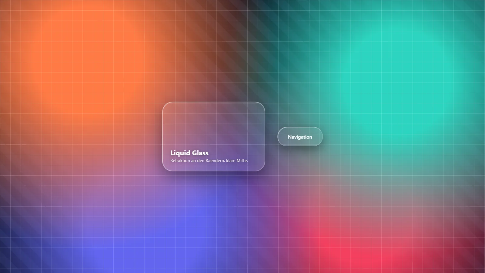

Apple’s Liquid Glass is the effect everyone suddenly wanted on the web in 2025. Semi-transparent bars and buttons that don’t just blur the background but bend it at the edges like real glass. It looks expensive, and the reflex is understandable: quickly rebuild it, done.
I did exactly that and collected every pitfall along the way. This piece is the guide I wish I’d had beforehand, first the physics, then the working code, then the quirks that appear in none of the glossy tutorials. And at the end the question of whether you even want this on a real client site.
One thing up front. Part of this article was wrong here for a few weeks. I had described a fix that works in every demo and still produces no refraction at all. What actually happens is under point 1 below.
Refraction, not blur: why Liquid Glass is different
The classic glassmorphism look is quickly explained: a semi-transparent surface, a backdrop-filter: blur() behind it. The light of the background is scattered, everything turns milky. Frosted glass.
Liquid Glass does something else. Real glass doesn’t just scatter light, it bends it. At a curved edge a ray changes direction, and the background appears displaced and distorted there. In physics this is Snell’s law: the angle at which a ray is refracted depends on the refractive index and the tilt of the surface. In the middle of a flat pane almost nothing happens, at the curved edge zone a lot does.
That is the core of Liquid Glass, and four properties separate it from simple blur:
- Refraction at the edges. The background is bent at the edges, the centre stays clear.
- A bright specular edge - the most visible difference from plain blur.
- Depth through shadow and a slight inner light.
- Optionally chromatic aberration, fine colour fringes at the edge, like a real lens.
Use only blur() and you get frosted glass. For the refraction you need more: an SVG displacement map.
The part that works everywhere: the CSS scaffold
Before the refraction comes in, there is the scaffold - and it runs in every modern browser. A large corner radius, a restrained blur with increased saturation (otherwise the glass turns grey instead of alive), a fine bright edge as the specular highlight and a shadow for depth.
.liquid-glass {
  position: relative;
  isolation: isolate;
  border-radius: 28px;                 /* a large radius is mandatory */
  background: rgba(255, 255, 255, 0.06);
  -webkit-backdrop-filter: blur(2px) saturate(180%) brightness(1.08);
  backdrop-filter: blur(2px) saturate(180%) brightness(1.08);
  border: 1px solid rgba(255, 255, 255, 0.28);
  box-shadow:
    inset 1px 1px 1px rgba(255, 255, 255, 0.6),   /* top glossy edge */
    inset -1px -1px 1px rgba(255, 255, 255, 0.15),
    0 18px 50px rgba(0, 0, 0, 0.4);               /* depth */
}
The saturate(180%) matters more than it looks: without the saturation boost every backdrop glass looks dull and greyish. With it, you already have solid frosted glass. For the real liquid effect the refraction is still missing.
The refraction: SVG displacement map
feDisplacementMap is an SVG filter that shifts each pixel of the background - as far as a second graphic, the displacement map, tells it to. The displacement is encoded in the colour channels of that map: the red value drives the horizontal shift, the green value the vertical one. A neutral grey (128, 128) means no shift, deviations push the background in a direction.
For Liquid Glass you want a map that mimics exactly what real glass does: flat in the centre (neutral grey, no refraction), a shift outwards at the edges. Generate this map from the signed distance function of a rounded rectangle and take its gradient as the surface normal, and you get exactly the bevel profile of a glass edge.
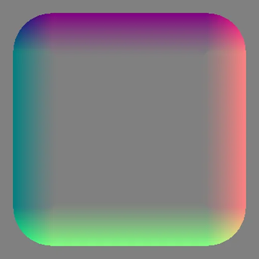
This is what that map looks like: grey in the centre, at the edges red to the right, cyan to the left, blue up, green down. Exactly this pattern produces the 360-degree refraction at the edge. It is bound via feImage and driven through backdrop-filter:
<svg width="0" height="0" aria-hidden="true" style="position:absolute">
  <filter id="lg" x="-0.25" y="-0.25" width="1.5" height="1.5"
          primitiveUnits="objectBoundingBox"
          color-interpolation-filters="sRGB">
    <feImage href="data:image/png;base64,..." preserveAspectRatio="none"
             x="0" y="0" width="1" height="1" result="map"/>
    <feDisplacementMap in="SourceGraphic" in2="map" scale="0.15"
                       xChannelSelector="R" yChannelSelector="G"/>
  </filter>
</svg>
@supports (backdrop-filter: url(#lg)) {
.liquid-glass {
backdrop-filter: url(#lg) blur(2px) saturate(180%) brightness(1.08);
}
}The @supports is not decoration: it ensures that only browsers which can do the SVG filter in the backdrop get the refraction - everyone else stays on the clean frost from the CSS scaffold.
If you don’t want to generate a map, feTurbulence as the displacement source gives you a quick, organic distortion look. It reads more watery than glassy, but it’s a one-liner and a good starting point. The clean edge look only comes with the bevel map.
The pitfalls no tutorial mentions
This is where it gets interesting, because these are exactly the points where I got stuck - and the glossy demo videos say nothing about them.
1. A map with alpha 0 looks right and is still dead
The most expensive mistake, and I had it sitting in this very guide for months. If you bind the map via feImage, Chromium can paint the image file as an additional visible layer on top of the element instead of treating it purely as the displacement source. The obvious way out is to export the map with an alpha channel of 0. feDisplacementMap only reads red and green, visibility depends on alpha, so both should work out together.
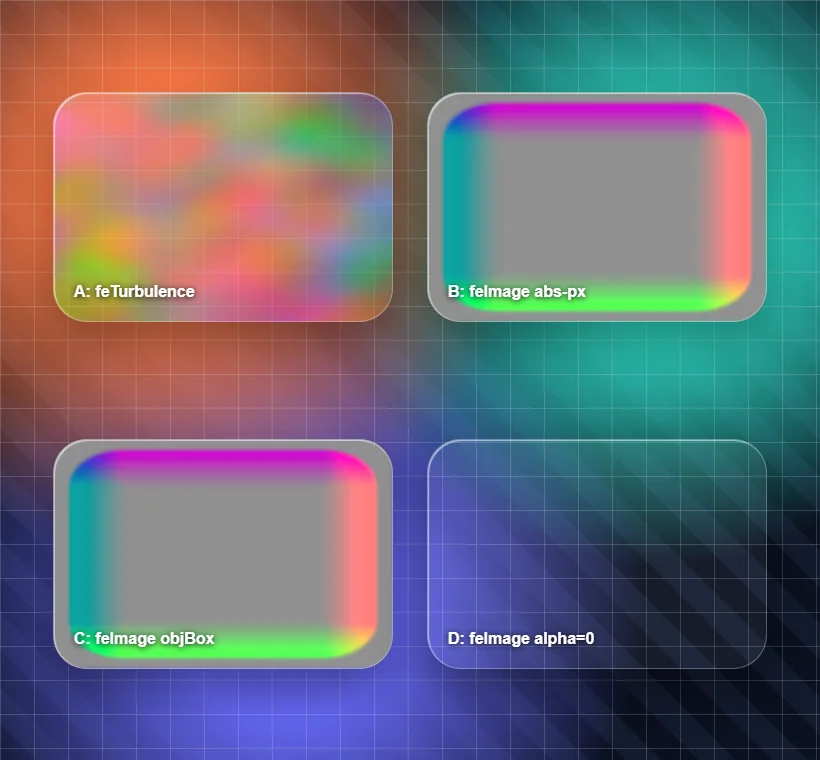
It does not. Chromium’s graphics library premultiplies the colour channels by the alpha value while decoding a PNG. At alpha 0 nothing but zeros is left in red, green and blue, no matter what the file contains. The filter therefore reads a map of zeros and shifts the entire background by a constant amount towards the upper left. Add some blur and it convincingly resembles refraction. It is only an offset though, and at an edge the content visibly slides past undistorted.
I only caught it through a measurement. I put a ruler of coloured stripes behind the glass and took screenshots in pixel steps to see which stripe ended up where. With a real lens the stripes have to compress and flip at the edge. They did not, they all travelled the same distance.
The correct way is alpha 255 plus an explicit filter graph whose final step does not output the map. The map stays a named intermediate result used only as in2, and what becomes visible in the end is exclusively the displacement result.
<filter id="lg-1" filterUnits="userSpaceOnUse" color-interpolation-filters="sRGB"
        x="-40" y="-40" width="680" height="130">
  <feImage href="data:image/png;base64,..." result="map"
           x="0" y="0" width="600" height="50" preserveAspectRatio="none"/>
  <feDisplacementMap in="SourceGraphic" in2="map" result="disp"
                     scale="50" xChannelSelector="R" yChannelSelector="G"/>
  <feMerge><feMergeNode in="disp"/></feMerge>
</filter>
2. The backdrop ends at the element edge
The second quirk explains why the refraction often looks completely different at the top than at the bottom. Chromium clips the backdrop to the element box. Whatever sits next to it is unreachable for the filter, no matter how far you sample. Everything beyond the edge is mirrored back at the edge.
That sounds like a limitation and is in fact the key to the effect. Sample deliberately past the edge and you get the inside content mirrored back, which is exactly the upside-down look you know from a water droplet on a window. A profile that only pulls inwards cannot produce that look at all.
3. Filter definitions are cached by name
The reason I spent a while hunting values that had been correct for ages. If you replace the <filter> element under the same ID with a new definition, the backdrop-filter happily keeps rendering the old one. With static CSS this never shows, with dynamically generated maps it shows immediately. Every rebuild gets a fresh ID here now, and the backdrop-filter value is updated along with it.
4. The refraction only appears bottom and right
A second classic: the effect only takes hold at the right and bottom edge, nothing happens top and left. The cause is percentage measures on the feImage (x="0%" width="100%"), with which Chromium maps the map incorrectly onto the element. The solution is to work either in objectBoundingBox units (one filter for all element sizes) or to set the map in absolute pixels matching the element size. Always verify over a fine grid with a large element - on small test surfaces the asymmetry is barely noticeable.
5. transform distorts the refraction
As soon as an element with backdrop refraction is animated with transform: scale() or rotate(), the filter’s coordinate space distorts and the refraction goes crooked. Plain translate is safe. Shape animations like the typical “wobble” of Liquid Glass therefore run better via border-radius morphing than via scale.
6. iOS and Safari don’t refract at all
The point that can sink an entire approach: Safari and iOS simply do not support SVG filters as backdrop-filter, for GPU stability reasons. There is no way to force real backdrop refraction on the iPhone - Apple’s own glass is built natively in Metal, not available in the open web. If you want the refraction there anyway, you have to duplicate the background and put filter instead of backdrop-filter on the copy, which is practically untenable with moving backgrounds on mobile. The pragmatic path: iOS gets the frost fallback, cleanly tuned with a bit more saturation and opacity, and Chromium gets the real refraction. The @supports above does exactly this separation.
Why a straight ramp looks wrong
Once the technique runs, the actual work begins: the profile. In other words, how far a pixel is displaced depending on its distance from the edge. The obvious solution is a linear ramp, a lot on the outside, less towards the centre. The result looks like a sheared copy rather than glass.
The reason is physics. A real lens does not stretch evenly. Towards the fold the stretching keeps increasing until the image flips over and appears doubled across a narrow band. That is the same caustic you see in a water droplet. A linear ramp has the same stretching everywhere, and that is exactly what takes the glass out of it.
It gets cleaner if you describe not the displacement but the source position, as a smooth curve with two zones. On the outside it reads behind the edge, which thanks to the mirroring from point 2 produces the mirrored band. Stretching peaks at the flip point. After that it eases out until the centre is one to one again. What matters is that the curve stays strictly monotonic, otherwise there are depths no scanline displays any more and content disappears into a dead zone while scrolling.
How that curve affects the result is hard to describe and easy to try. So there is a dedicated page with sliders for it: the Liquid Glass lab. You can move the fold, change the stretching and drag the background through the glass.
Accessibility is not an afterthought here
Glass effects clash with accessibility faster than almost any other UI pattern. Three things are mandatory:
- Measure contrast after the blur, not before. Text on glass can be legible over a calm background and drop below the WCAG threshold of 4.5:1 over a busy one. What counts is the final state.
- Respect prefers-reduced-transparency. Anyone who has set reduced transparency in their system should see a solid surface instead of a glass effect. That’s a few lines of CSS, but they decide usability for a real share of visitors.
- Don’t stack. Glass on glass becomes unreadable. One glass surface per view.
@media (prefers-reduced-transparency: reduce) {
  .liquid-glass { background: #0f172a; backdrop-filter: none; -webkit-backdrop-filter: none; }
}
And now honestly: do you need this?
The code works, the effect looks good - and yet the most important question is not “how” but “whether”. Apple itself makes the answer fairly clear. In its own design guidelines Liquid Glass belongs on the navigation and overlay layer: bars, floating buttons, sheets. Explicitly not in the content, not on lists, tables or text surfaces. And translucency is meant to be functional, letting the underlying context show through, not decoration.
For an ordinary company website that means: as a full-surface look, Liquid Glass is almost always the wrong choice. It costs computing power, it endangers legibility, and on the iPhone - so for the majority of visitors - it renders as a plain blur anyway. The entire effort for the refraction is invisible on exactly the devices most people use to see the site.
Where it pays off: as a discreet detail. A floating navigation bar, a cookie banner, a single overlay where the glass deliberately lets the content below show through and creates a moment of quality. Sparingly, functionally, with a clean fallback. The way Apple means it.
Conclusion
Liquid Glass on the web is not magic but light refraction via a displacement map, plus a handful of quirks that sit between the pretty demo video and the working implementation. The map that quietly turns into a zero matrix at alpha 0, the backdrop that ends at the element edge, the cached filter, the asymmetry from wrong measures and the complete absence on iOS. Knowing these saves you several frustrating afternoons.
The tricky part about these mistakes is that none of them throws an error. It looks vaguely glassy every time. So the only way forward is measuring, with a known pattern behind the glass and a calculated expectation of where it should end up. If you want to play with it without building anything, the sliders are waiting in the Liquid Glass lab.
FAQ
What is the difference between glassmorphism and Liquid Glass?+
Glassmorphism (frosted glass) scatters light: a blur behind a semi-transparent surface. Liquid Glass refracts light: the background is displaced at the curved edges, as if you were looking through a real glass lens. The most visible difference is the bright specular edge and the distortion of the background right at the edge, while the centre stays clear.
Does Liquid Glass work in all browsers?+
No. The real refraction through an SVG filter in backdrop-filter only runs in Chromium browsers (Chrome, Edge, Brave). Safari and iOS do not support SVG filters as backdrop-filter, for GPU stability reasons. There a fallback to plain blur() with increased saturation applies. The specular edge and the large corner radius work everywhere.
Why does my displacement map show up as a grey image?+
Because Chromium can paint an image loaded via feImage inside a backdrop-filter as an additional visible layer, instead of using it only as the displacement source. The commonly recommended workaround, exporting the map with alpha 0, renders it useless though, because Chromium premultiplies the colour channels by alpha while decoding. The correct approach is alpha 255 combined with an explicit filter graph whose final step does not output the map, for example an feMerge over the displacement result.
Why do my changes to the SVG filter have no effect?+
Chromium caches filter definitions by their ID. If you replace the filter element under the same ID, the backdrop-filter keeps rendering with the old definition. The fix is to assign a fresh ID on every rebuild and update the backdrop-filter value accordingly.
Should I use Liquid Glass on my website?+
In most cases sparingly or not at all. Apple itself limits the effect to the navigation and overlay layer and warns against using it in content. On an ordinary company website it costs computing power, endangers legibility and renders on iPhones as a plain blur anyway. As a discreet detail on a bar or a floating button it can be worth it, as a full-surface look rarely.
Is Liquid Glass accessible?+
Only with care. The contrast of text on the glass has to be measured AFTER the blur, not before - over busy backgrounds it easily drops below the WCAG threshold of 4.5:1. On top of that, prefers-reduced-transparency and prefers-reduced-motion must be respected: anyone who has set reduced transparency in their system should see a solid surface, not a glass effect.
Want to know more?
In a free intro call we discuss how you can use these topics for your company. Not a sales pitch, but an honest assessment.
Book a free intro call