
Scroll-driven effects have been a fixture of ambitious websites for a few years now, and they work when they are done well. What such a build looks like technically I described using the example of a website you swipe through instead of scrolling. This piece answers the question that leaves open: what has to be added so the effect works with more than a mouse.
Because that is where most implementations fail. Not on looks, not on performance, but on keyboard operation.
The most common mistake costs one line
The classic case is a container with overflow: auto or overflow: scroll holding scrollable content, which itself cannot receive keyboard focus. With a mouse the region scrolls fine, with a wheel too. Anyone moving through the page with the tab key simply skips past it and never reaches the content.
That is a failure of WCAG 2.1.1, Keyboard, and it sits at conformance level A. So not on the polish tier, but on the lowest one.
The remedy is unspectacular. Either the scrollable region already contains a focusable element such as a link or a button, in which case it is reachable through that. Or it gets a tabindex="0" of its own:
<div class="story-panel" tabindex="0" role="region" aria-label="Project timeline">
  <!-- scrollable content -->
</div>
That puts the container into the tab order, and once focused it can be scrolled with the arrow keys. The role and aria-label are not mandatory, but they turn a nameless focus stop into a named region, which improves orientation with a screen reader considerably.
The second classic concerns order. When sections are faded in and out or shifted horizontally as you scroll, the visible order often diverges from the document order. Focus then appears to jump around the page arbitrarily for keyboard users. That is WCAG 2.4.3, Focus Order, also level A. The underlying rule is simple: what appears one after another visually should sit one after another in the markup. Anyone establishing the order purely through CSS or transforms is building this problem in.
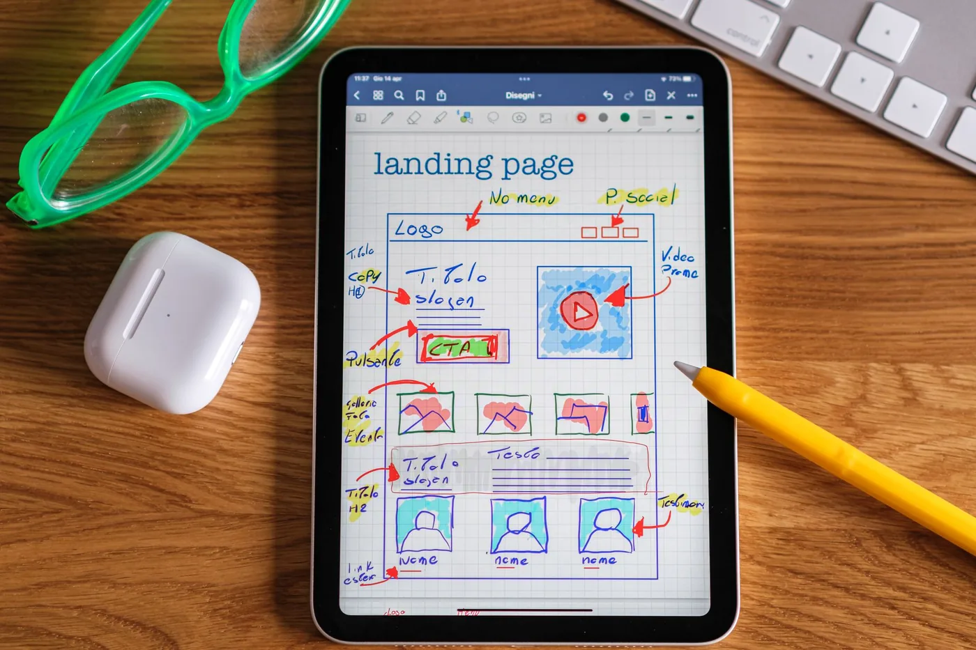 Photo: Davide Baraldi / Pexels
What the research actually shows
Nielsen Norman Group studied scroll-driven effects and did not condemn them wholesale but drew distinctions. The majority of test participants were at least mildly disoriented. The problems weighed heaviest where the altered scroll behaviour coincided with longer passages of text, because reading and an unfamiliar scroll rhythm interfere with each other. On small screens the effect intensifies further, because the same sequence takes longer there.
More interesting than the criticism, though, is the other half of the finding, namely the conditions under which the effect worked:
- below the fold rather than in the first screenful
- with a fast scroll ratio that demands little input
- alternating with normally scrolling sections rather than across the whole page
- without larger amounts of text inside the animated area
- on desktop rather than on a phone
That is a usable design rule, and it matches what I see in projects. An effect that reveals a graphic or a product build-up step by step carries its weight. An effect you are supposed to read running text through is an irritation.
prefers-reduced-motion is the biggest lever
Anyone who has set their operating system to show less motion usually has a good reason. For some users that is comfort, for others large-area movement is a genuine problem up to dizziness and nausea. The setting can be queried in CSS, and the effort is minimal:
.story-panel {
  transition: transform 600ms cubic-bezier(0.4, 0, 0.2, 1);
}

@media (prefers-reduced-motion: reduce) {
  .story-panel {
    transition: none;
  }
  .story-track {
    /* back to normal, document-native scrolling */
    transform: none;
    overflow-y: auto;
    scroll-snap-type: none;
  }
}
What matters is the direction of thinking. The point is not to switch off the animation and leave the user with a half-working remainder, but to offer a fully valid calm version. All content is present, it simply appears without movement and with normal scroll mechanics. If that does not work, it is a sign that content and effect are wired together too tightly.
Incidentally, the same test works without any settings at all: what does the page look like when JavaScript does not run? Is the content still there and readable? If yes, the foundation is solid and the effect sits on top as a layer. If no, the entire content hangs off the animation, and that is the actual thing to fix.
 Photo: Thirdman / Pexels
What this means legally
For sites in scope of European accessibility legislation this is not a matter of taste. The law points to the harmonised European standard and thereby to WCAG levels A and AA. Both points above, keyboard operability and focus order, sit at level A.
In practice that means an elaborate scroll effect can be excellent design and still fail a requirement that a single attribute and a media query would have satisfied. I made the same point about WebGL and accessibility, and it holds here too: the laborious part is not accessibility, it is retrofitting it into something designed without it.
 Photo: Tima Miroshnichenko / Pexels
The checklist I use
Four steps to run before going live, together taking under an hour:
- Press tab until you are through the whole page. Is every scrollable region reachable? Is it visible where focus currently sits? Does the order jump?
- Reduce motion at the operating system level and reload. Is all the content there, is everything readable, does scrolling behave normally?
- Switch off JavaScript. Does the content stay visible, or is the page empty?
- Scroll through it on a phone. Does the effect feel sluggish or uncontrollable there? If so, it belongs disabled on small screens.
None of these steps requires specialist knowledge or a testing tool. They catch the bulk of what goes wrong in practice.
If you have a site with elaborate scroll effects and want to know whether it works with a keyboard and a screen reader, I am happy to take a look. Usually it is a handful of spots that break, and they can be fixed deliberately without giving up the effect.
FAQ
Is scroll storytelling inherently an accessibility problem?+
No. The problem almost always comes from the implementation rather than the idea. A section that builds up a graphic as you scroll is uncritical as long as it stays reachable by keyboard, focus does not jump around, the content is readable without the animation, and anyone who has reduced motion enabled gets a calm version. Those four points are what usually gets forgotten.
Which WCAG criteria typically apply to scroll-driven effects?+
Most often 2.1.1 Keyboard at level A, when a scrollable region cannot receive focus, and 2.4.3 Focus Order at level A, when focus order skips the region or the visual order no longer matches the document order. On top of that, 2.2.2 applies to automatically running motion, because movement has to be pausable.
Is prefers-reduced-motion enough on its own?+
It is the single most effective step, but it only covers the motion side. Evaluating the query and falling back to normal scrolling solves the problem for everyone who has disabled motion at the operating system level. Keyboard operability, focus order and readability of content without the animation are untouched by it and have to be solved separately.
What does this mean for sites under European accessibility law?+
The European Accessibility Act and its national implementations point to the harmonised standard and thereby to WCAG levels A and AA. Failures of 2.1.1 and 2.4.3 both sit at level A, the lowest tier. Anyone using scroll-driven effects on a site in scope should check these two points before worrying about finer details.
Want to know more?
In a free intro call we discuss how you can use these topics for your company. Not a sales pitch, but an honest assessment.
Book a free intro call